Monday, 15 March 2010

Main Task - Music Magazine Double Page Spread Second Draft

I made relatively few changes for this draft, but I feel that they definitely improve the quality of the double page spread and were worth doing.
The first change was the re-positioning of the pull-quote so that it was directly within a single column rather than bridging across two. I did this because I thought that in its previous position, although more interesting, the text box mucked up the alignment of the text so that it looked perfectly square on the right hand side but jagged on the left hand side. Moving it solved this, and it also meant that all the text in the columns was moved down slightly, therefore achieving my other objective of making the text closer to Kerry's head. I did in fact add more text as well to make the text get even closer to her, but it ended up detracting from the photo of her face and also was difficult to read as there was only one word a line.
The next thing I changed was the cutting out and text wrapping of Kerry Anne's main photo. It was fairly unnoticeable, hence why I didn't mention it in the post itself, but some of Kerry's arm and front had been made completely white instead of their actual colour when I used the clipping path tool to too great an extent. I rectified that issue in this draft by using different clipping tool settings (previously I used detect edges, this time I used Alpha Channel) and making sure carefully that I had only cut out what needed to be cut out. Also doing this meant that the outer edges of Kerry's body and hair were cut out more smoothly, since it is more difficult in inDesign to manually cut and smooth things than it is in Photoshop.
Other than some very minor text editing, the final change I made was to change the font used in the standfirst and contextual paragraph from Georgia to Book Antiqua. I did this because I wanted to retain the formal impression that Georgia gave off but wanted something a bit less obtrusive and bulky. When one compares them side-by-side the difference can easily be seen, or at least I can easily see it.
Hopefully this is of a high enough standard to be my final draft, but I will need to get opinions from my teacher and classmates before I can decide whether this really is the case.

Friday, 12 March 2010

Main Task - Music Magazine Double Page Spread First Draft

Well, here it is. My double page spread.
It seems my worries about having to possibly cut out some of my text were unfounded, as it in fact turned out that I needed to add more text to try and fill up the space! In an ideal world I still would have liked to have written a bit more, so that the text reached the top of Kerry's head on the right-hand page and there would have been less white space. However, I can try and do this in a later draft.
I used the software Adobe InDesign CS4 to create my double page spread. I used this rather than Photoshop (which I used for the cover and contents) because Photoshop is primarily a photo manipulation program, as I learnt the hard way when manoeuvring the different pieces of text one by one on my contents page. InDesign is different in that, as the name suggests, it is a program for designing things, such as posters, flyers, brochures, magazines and books. I found using InDesign quite challenging though, since it functions almost completely differently to Photoshop and therefore took a lot of time to adapt to. Once I got the hang of it though I found it to be extremely useful, so I am glad I persevered with it.
I still used Photoshop in the creation of the DPS, insofar as I still had to use it to edit my photos. On both the pictures I pumped up the exposure and cropped them, and the band picture on the left I also placed into a polaroid-camera type frame. The right-hand picture took an amazingly long time to crop as I had to go through the usual process of lassoing and then erasing stuff a bit at a time, and then perfecting it all with the blur tool. That probably doesn't sound too strenuous but it really was, since I had to be careful to cut away only the background and not accidentally cut off any of Kerry herself, and the picture was of a really large size which didn't help. I think that some parts of her still look slightly as if they were cut out, but overall I feel I did a pretty good job.
I found it quite difficult to arrange the text in a way which I deemed to be interesting, and it was mostly a process of trial and error in which I tried many different layouts and combinations (some of which I'll post later in a step-by-step DPS section). After the headline of the article I had what I considered to be the "background information" paragraph (though its official name is a standfirst): a section of text which gives the reader a brief overview of who the article/interview is about/with and why this person is interesting. Underneath this I had the names of the interviewer and photographer (both fictional of course, as putting "Chris Coales" for everything would be boring). I placed the names here as I noticed from my research on music magazines that this is the usual place for putting them; in fact there are very few instances indeed on double page spreads where this isn't the case.
After this I began arranging the text in columns, with the first section of text in the columns being an introductory paragraph: a section written in prose which sets the scene and possibly describes the interviewer meeting the interviewee. I used this section to provide more contextual information on Kerry Anne and briefly describe the surroundings. I typed this section in the font Georgia, the same font I used for the "background information" paragraph, because I wanted to use a different font from the one I was to use for the actual interview so as to distinguish between them. I think I achieved this quite well, and I don't think that the fonts clash too badly at all.
The next, and longest, section of text was the interview itself. I used the font Calibri as it is sans-serif which distinguishes it from Georgia which is serif. I also feel personally that Calibri has a comfortable simplicity, the kind that can be put to good use in magazines where there is a lot of small text to read. I put the questions in bold to show when the interviewer was speaking, and separated each set of question and answer by a single line for uncluttered readability. I also copied a quote from the text out and enlarged it and coloured it red, as this technique of taking an especially interesting quote from an article and drawing attention to it is used regularly in music magazines.
I wrote more than I originally meant to here, and there are less stages involved in making something in InDesign than in Photoshop, so I will not need to do a post this time showing step-by-step information of how I made my double page spread. As always, comments are welcomed.

Thursday, 11 March 2010

Main Task - Music Magazine Cover Third Draft

I changed very little from my second draft to my third draft, which should hopefully be an indicator that I have reached my final draft. The first thing I changed was that I shifted the alignment of the "Plus" section of the text to the right, as this is what the covers of music magazines tend to do.
The other thing I did was try to cover up the gold button on Kerry's shoulder, as I was told that it was distracting since it looked rather prominent on the cover. I covered it up by nudging the Leanne Bell album cover upwards, which covered up half of the button. I then used a combination of the patch tool, clone stamp tool and blur tool to remove the rest of the button on Photoshop, and eventually did so to a standard I considered adequate. I also swapped around the positioning of the "The Accelerators" story with the "Leanne Bell" story, so that the album cover would be next to the relevant piece of text.
This is likely to be the final draft of my cover, so long as no one else is able to give me any ideas as to what I can change.

Main Task - Music Magazine Contents Page Second Draft

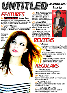
This is the second draft of my contents page, and it took me a long time to do all the changes. This is primarily because each line of text is in its own text box, and I had to go through and individually re-position each one and move text from one line/text box to another line/text box. You may also notice that all the text has been compressed slightly; this was to make room for the new picture I added. I removed the old man due to criticism from both my peers and myself, and replaced it with a picture relating to one of the main stories. This actually makes the contents page more realistic, since it is more likely that there will be a picture relating to one of the features which the magazine is showing off about rather than depicting one of the regulars at the very bottom of the page.
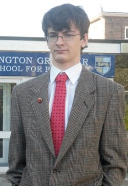
The image I used was cut out from one of the first photos I took, though I did not post it with the others. That's why I'm posting it here, for your convenience -->
I had to edit the photo quite a lot; I removed Jonny's spots, got rid of his red eyes, lassoed around him before doing the finishing cutting out touches with the eraser and then used the blur tool to smooth out his edges. I put a frame around the cut out Jonny and applied a stroke and drop shadow effect to it. I decided to fill in the frame's background in red, though whether I'm going to keep it like that I'm not sure as it looks quite obtrusive. I finished it up with a lens flare effect and a suitable caption.
Despite definitely making the contents page more interesting the picture forced me to move all the text around which was extremely annoying and time-consuming. I did it though, but I feel that perhaps the original text layout was a little better. There's not really much I can do about this, as if I had kept the original text layout there would have been no room to insert another picture. Also the re-arranging of the text meant that I had to change some of the text slightly to make it shorter and allow it to fit in, such as "Sexii's House" to "Doobey" (fortunately removing the band name "Sexii's House" was no great loss, though unfortunately the replacement name wasn't any better).
The final things I did were to change the page number of the Kerry Anne story and move the caption referencing it up slightly. I made the former of these changes when I realised that a double-page spread would have to start on an even number, and the latter change was made to try and make it look like there was less blank space.
If I do make any further changes to this contents page it will likely only be small things, like the background in the picture of Jonny.

Monday, 8 March 2010

Double Page Spread Article - Second Draft

Despite titling this blog post as a "Second Draft" it would probably be more accurate to call it a rewrite. This is because I came up with more ideas for the article after doing the cover and contents page, and also I underestimated how much I would have to change the interview from being about a young man to being about a young woman. After some experimentation I found that it is possible I won't be able to fit the entirety of the article on the double page spread, and although this make me sad that some of my hard work may be wasted I must do what looks best for the magazine. I will abandon my feelings and ignore sentimentalities such as these, all for the sake of creating the best music magazine I can possibly make. As Chairman Mao said in his Little Red Book, "[A Communist] should be more concerned about the Party and the masses than about any individual, and more concerned about others than about himself." I am a Communist, in that I am more concerned about the overall standard of my work than my petty individual pride.

Friday, 19 February 2010

Music Magazine Contents Page First Draft - Step-by-step

As you will soon see, there were much fewer steps involved in the creation of the contents page than there were in the creation of the front cover. This is due to the fact that the contents page is made up mainly of text, and since text is very easy to edit one doesn't need to save their work quite so regularly as when working with layout and images. I did say before though that there are going to be a lot of changes, so chances are there will be many more production steps after the ones shown. Before the actual stages though, I am going to show the rough contents ideas/plans that I drew out and scanned in:


Although I had actually already applied effects in Photoshop to the main photo a while before deciding to use it, I shall try to remember in detail what I did to it. I know the main thing I did was pump up the contrast and brightness. I also experimented with lighting effects, but only applied very small ones as they made too much of a difference otherwise. I also changed the exposure, offset and gamma correction settings. The overall combination of these effects made the picture's background mostly completely white, whitened Kerry's face and made less thick strands of hair appear as a sort of yellowy light, and despite my lack of technical image terms I thought all of which looked pretty cool. I then just had to cut around Kerry using the lasso and then put the picture into a contents page-sized canvas.
Now the image had been sorted I next decided to put a smaller version of my masthead at the top left of the page, so as to reinforce the idea of a house-style/brand identity. Next to it I put a date and issue number to comply with music magazine conventions; I also made the font they were in Oceania which is the same font used for the masthead. I added a caption for the photo which would tell the reader what story the picture relates to and on which page one can find out more. I did this because from my music magazine research I saw that nearly all photos on the contents page have a caption such as this, and so my having one would further allow me to abide by music magazine conventions and therefore make my magazine look more realistic. At this point I used the Calibri font, due to its simplicity which made it unobtrusive and easy to read. The final thing I did during this first stage was add a "Features" heading, since as can be seen from my plans I had already decided to separate my contents page into the three categories of Features, Regulars and Reviews.

Here I added the other two section headings of "Reviews" and "Regulars". I changed the font for these and "Features" from Tahoma bold to Lucida Sans Typewriter; the reason for this was that I felt the Tahoma bold font became too fat-looking when made the text a bigger size, and when I took off the bold it looked too skinny. I tried a variety of different fonts and found that Lucida Sans Typewriter looked fairly similar but wasn't what I considered too fat or skinny. I then changed the font of the photo's caption to Lucida Sans because it was just as comfortably simple as Calibri and also meant that I wouldn't have to use too many different fonts, since that could have made the contents page look tacky and unprofessional (my research showed that music magazines try to limit the number of fonts they use unless they're going for a specific feeling, such as scary or happy). For this same reason I also used Lucinda Sans for my page number, my Kerry Anne heading and my story summary. I noticed that on both the Mojo and Q contents pages the cover story is labelled "Cover Story" so as to separate it from the rest of the features and draw attention to it. I decided to do a similar thing for my contents page, which is why there is a box with "Cover Story" written in it. I used red on black since they were both colours already present on the contents page (which is good for reasons similar to those about not using too many different fonts) and it manages to catch the eye, and that is after all the point of having it. The layout I had begun to instigate is fairly similar to the top left possible layout on my second page of rough contents ideas.

The change here is that I added all the contents page text. As you can see by comparing it with my first page of rough contents ideas, a lot of the things on there were either the same as or adapted from what I had originally planned to write. There were also many things that I had come up with during the production of the front cover, such as Rockability and Leanne Bell, and these I needed to include to retain the continuity between the things on the cover of a magazine and the things on its contents. I moved the "Cover Story" box down so that it was between the page number and Kerry Anne, since I felt that in its previous position it was wasting a line of space and also just looked a bit awkward. I had to erase some of the nice yellow effect around Kerry's hair to make room for the text as I felt that placing the text over it didn't look very good. I then had to arrange each line of text individually to make them fit around the picture.


For this final stage I made only very small changes in a somewhat futile attempt to make the contents page more interesting. I thought that another photo could spice it up a bit, so I placed one where it would not affect the layout too much and where it would be relevant; this photo ended up being of an old man next to "The Good Ol' Days" section. It is relevant and doesn't affect the layout, but despite this still looks pretty bad. I also, as said in the last blog post, desaturated the photo to make it appear older. I tilted it as well to make it more interesting. To make room for the photo I had to Kerry Anne caption to the left of her picture; I actually preferred this to where it was previously as it utilised what was previously empty space.

Wednesday, 10 February 2010

Main Task - Music Magazine Contents Page First Draft

This is the first draft of my contents page. I feel that there is a lot that needs to be done on this, though to be honest I am not yet sure what. That is why I posted it here on my blog, so that people might be generous enough to post constructive criticisms with ideas about how to make it better.
I shall first talk about the things I do like. I feel that the image of Kerry dominating the bottom left of the page is very effective, and I like how she seems to be looking at the caption about her. I also like how I've made the text wrap around the main image, so that no space is wasted. The final thing I like is the different coloured page numbers, which I did to make it clear that they were separated. The colour used for the page numbers is the same colour I used for some of the text on the cover, and this should help slightly in maintaining a house-style.
Now for what I don't like. Somehow, despite being pretty much completely filled up, the contents page looks quite empty and boring. Perhaps this is because I used too much text and not enough pictures, so for my next draft I might try making the font sizes smaller so I can compress the writing together more. I tried to make the page a bit more interesting by having a picture on the bottom right; I used a picture of a man from my Mum's work as he is old and an old man is relevant to the article "The Good Ol' Days". I desaturated the picture to add to the feeling of oldness. Despite my efforts the contents page still looked boring, but now it was boring with a random old man on it. Something else I don't like is the date and issue number at the top right. I included them to comply with the conventions of all music magazines, but I think that they don't look very good. I considered and experimented with putting some kind of coloured box or circle around them to make them more appealing, but alas, it looked even worse, which is why there is no frame now.
Anyway, criticisms and ideas: throw them at me. Thank you.