
- Stereo - Music related, simple one-word title, easy to remember
- Untitled Track - Also music related, ironic, quite cool-sounding, gives off an attitude of calm disinterest
- Restless - Kind of music related, restless from partying perhaps?, sense of excitement
- Experience - Not really music related but seems laid-back and cool
- RockIt - Music related, pun on rocket so easy to remember, put into one-word so it has a cool simplicity
Monday, 28 December 2009
Short list of Possible Magazine Titles
After having constructed my original list, I decided that before asking others for their I opinions I should first shorten the list down to five possible titles. This is because the responses would be more concentrated and therefore easier to interpret, and also some of the original ideas are so stupid that it would be pointless to include them. The following is my short list of five titles and my reasons for including them:
Possible Magazine Titles
Just as with the school magazine for the preliminary task, I decided that the first thing I should do was decide upon a magazine title. I began by listing any ideas that popped into my head, and then began to use the "random article" function on Wikipedia for inspiration. I ended up with the following list:
- Power
- Poison
- Stereo
- Untitled Track
- Adaptation
- Situation
- Glow
- Restless
- Tonight
- Raw
- Bone
- Incus
- Malleus
- Hammer
- Mousike
- Rockability
- Present Day
- Present Time
- Aero
- RockIt
- Orgy
- Experience
- Pound It
- Control
- Blahla
- Sunshine
- Moonshine
- MewSick
- Astro
- Imagine Breaker
- Sound Dimension
- Index
- Pulp
- Strum
- Spectrum
- Spark
- Schizoid
- Sorcery
- Mantrik
Friday, 25 December 2009
Magazine Analysis of Mojo

Below is a table I made comparing what I thought to be the five main UK music magazines.


Main Task Brief
The following is the brief we were given at the beginning of the year for the main task.
Main task: the front page, contents and double page spread of a new music magazine (if done as group task, each member of the group to produce an individual edition of the magazine, following the same house style).
All images and text used must be original, produced by the candidate(s), minimum of four images per candidate. The presentation of the research, planning and evaluation may take the form of any one, or combination of two or more, of the following:
- a presentation using slideshow software such as Powerpoint;
- a blog or website;
- a podcast;
- a DVD with 'extras'
Monday, 14 December 2009
Preliminary Task - Evaluation
I am happy overall with how my preliminary task turned out, as I feel that both the cover and contents page are of a fairly high quality. As can (hopefully) be seen, I decided to do more work than necessary on the contents page and made it into a more finished product rather than just a rough layout. I used Adobe inDesign for both cover and contents.
I feel that the front cover largely conforms to the codes and conventions of school magazine, though it may actually be a bit too trendy. However, I see this as an advantage rather than a negative thing, as I could be breaking new ground with a magazine that students will actually read. The person in the photo is not the usual type of geeky nerd that one would expect to see on a school magazine cover, and therefore the student body should be able to relate to him rather than wanting to punch him in the face. The photo is also good for interesting the reader, as people are more likely to want to read about someone cool-looking rather than some geeky glasses-wearing teenager.
The font Kitty Katt that I used for the magazine title and main headline is effective as the letters are strangely spaced out from each other and are sans-serif, giving an overall more infromal impression. On the bottom right of the cover is an "Also inside" section with a lined paper background. I think this is good as it makes the information easily digestible and the paper background helps to reinforce the school theme. The main headline is placed in such a way that it is near the centre of the cover, thereby drawing attention, without obscuring Glenn's face, as this would have looked unprofessional and generally bad.
The layout of the contents page is very simplistic, but I find this simplicity to be good and vey fitting of a school magazine. when I start the main task of doing a music magazine I will obviously need to come up with exciting contents page layouts, but for the moment being exciting is largely irrelevant.
Thursday, 10 December 2009


Possible School Magazine Cover Photos


These photos are some of the ones that I set up and took, but they weren't good/appropriate enough to be used on either my cover or contents page.
Planning for Preliminary Task
A while ago I began planning my preliminary task, which is to design and produce the front cover and a mock-up contents page of a new school magazine. I set myself the following list of planning tasks:
The first thing on my list was to decide upon a title appropriate for use on my magazine's cover. This may seem like a slightly insignificant task, but the title actually plays a large part in determining the layout and aesthetic structure of the cover. It is also essential that the font used in the magazine is complementary of the title; for example, a school magazine entitled "Happy Wilmo" would look strange if the font used was dark and Gothic.
My first step in coming up with a effective title was to make a list of possibilities., which is as follows:
Photos
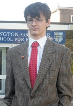
 I decided the next thing I should do was to take photos that could be included on my cover, as I couldn't yet choose my fonts since I would need something that complemented my picture. I went around school taking pictures of different students in different places /situations, such as the science labs, the computer rooms, the library, the school entrance and the school grounds. I took a wide range of photos, amounting to 103 in total, and doing so allowed me to have more photos than I needed which allowed me to have more of a choice. It also meant that I could have photos to include on the contents page. I have uploaded some of the pictures I took to give a better idea about the effort I put in, and also so that the people who I didn't include on my cover still feel their posing was worthwhile. I asked people, including my teacher, for advice regarding which picture they thought would be most appropriate for the cover of a school magazine. It was widely agreed that the photo I had taken of Glenn in the library (shown above) was the best one, and I decided to use it.
The next thing I had to do was edit the photo in Adobe Photoshop. The first thing I did was remove Glenn's spots with the spot removing tool, as I believed that people would not like a magazine cover with someone spotty on it. I then decided to make the background of the picture black and white, while keeping Glenn and the book he's holding in colour. To apply this effect I desaturated the whole photo and then used the history brush to re-colour Glenn and the book.

Rough Layout of Cover
The next thing I had to do was a rough layout of my cover, so that I had an idea of what to include and where to include it. this was useful as it let me mess around with things to see what looked best, and as it was only a rough plan it didn't matter if things went wrong. The layout I did is to the right and it is interesting to compare it to how my cover actually ended up.
Information on School events
I had already decided to make the main headline on the cover be about the school library, since I was using the photo of glenn in the library and the story had to be relevant. However, I also had to research school events so I could get some ideas on possible headlines. I did this by looking over past school newsletters and by asking teachers about any events that are coming up. In all honesty this didn't end up being very useful and I mostly made up the headlines that I used.
Choosing Fonts
This took a bit of time, as I went through each of the fonts installed on Photoshop to see which was most suitable. For the magazine title and main headline I used the font Kitty Katt and for the lesser writing I usually used variations of Lucinda Sans. I made the font colour for the title blue as it is in keeping with the school badge, which I also wanted to include. For the main headline I used yellow as it stands out from the largely desaturated background.
- Decide on a title
- Take photos.
- Do rough layout of of cover
- Get information about school events (which can be referenced on my cover)
- Choose font/s
The first thing on my list was to decide upon a title appropriate for use on my magazine's cover. This may seem like a slightly insignificant task, but the title actually plays a large part in determining the layout and aesthetic structure of the cover. It is also essential that the font used in the magazine is complementary of the title; for example, a school magazine entitled "Happy Wilmo" would look strange if the font used was dark and Gothic.
My first step in coming up with a effective title was to make a list of possibilities., which is as follows:
- WGSB Mag
- Weekly Wilmington
- Wilmington Weekly
- Weekly Wilmo
- Wilmington Mag4Skool
- Wilmag
- Wilmington's Termly Times
- Wacky Wilmington
- Wilmington Knights
- WGSBlast
- Wilmington Grammar Snapshot
- Wilmington Wheeze
- Wilmington Wagger
- Wilmington Wailer
- Wilmington Woof
Photos
 I decided the next thing I should do was to take photos that could be included on my cover, as I couldn't yet choose my fonts since I would need something that complemented my picture. I went around school taking pictures of different students in different places /situations, such as the science labs, the computer rooms, the library, the school entrance and the school grounds. I took a wide range of photos, amounting to 103 in total, and doing so allowed me to have more photos than I needed which allowed me to have more of a choice. It also meant that I could have photos to include on the contents page. I have uploaded some of the pictures I took to give a better idea about the effort I put in, and also so that the people who I didn't include on my cover still feel their posing was worthwhile. I asked people, including my teacher, for advice regarding which picture they thought would be most appropriate for the cover of a school magazine. It was widely agreed that the photo I had taken of Glenn in the library (shown above) was the best one, and I decided to use it.
The next thing I had to do was edit the photo in Adobe Photoshop. The first thing I did was remove Glenn's spots with the spot removing tool, as I believed that people would not like a magazine cover with someone spotty on it. I then decided to make the background of the picture black and white, while keeping Glenn and the book he's holding in colour. To apply this effect I desaturated the whole photo and then used the history brush to re-colour Glenn and the book.

Rough Layout of Cover
The next thing I had to do was a rough layout of my cover, so that I had an idea of what to include and where to include it. this was useful as it let me mess around with things to see what looked best, and as it was only a rough plan it didn't matter if things went wrong. The layout I did is to the right and it is interesting to compare it to how my cover actually ended up.
Information on School events
I had already decided to make the main headline on the cover be about the school library, since I was using the photo of glenn in the library and the story had to be relevant. However, I also had to research school events so I could get some ideas on possible headlines. I did this by looking over past school newsletters and by asking teachers about any events that are coming up. In all honesty this didn't end up being very useful and I mostly made up the headlines that I used.
Choosing Fonts
This took a bit of time, as I went through each of the fonts installed on Photoshop to see which was most suitable. For the magazine title and main headline I used the font Kitty Katt and for the lesser writing I usually used variations of Lucinda Sans. I made the font colour for the title blue as it is in keeping with the school badge, which I also wanted to include. For the main headline I used yellow as it stands out from the largely desaturated background.
Preliminary Task Brief
The following is the brief we were given at the beginning of the year for the preliminary task.
Preliminary exercise: using DTP and an image manipulation program, produce the front page of a new school/college magazine, featuring a photograph of a student in medium close-up plus some appropriately laid-out text and a masthead. Additionally you must produce a mock-up of the layout of the contents page to demonstrate your grasp of DTP.
Preliminary exercise: using DTP and an image manipulation program, produce the front page of a new school/college magazine, featuring a photograph of a student in medium close-up plus some appropriately laid-out text and a masthead. Additionally you must produce a mock-up of the layout of the contents page to demonstrate your grasp of DTP.
Subscribe to:
Comments (Atom)
