Monday 22 March 2010

Evaluation Question 7

Looking back at your preliminary task (the school magazine task), what do you feel you have learnt in the progression from it to full product?


When I compare my preliminary task and main task side-by-side like this I realise just how much I have learnt over the course of only a few months. However, one can also see that my core designing thoughts (such as my love for whiteness and simplicity) have stayed the same. The first thing I learnt after doing my preliminary task was that things always take longer than expected, and so I tried to address this by leaving more time for me to get things done on my main task. Also I had to take into account that while models, props and backdrops were easy to come across at school for the preliminary task (after all, I was doing a school magazine and so only needed to grab whatever student was walking past and chuck them into a classroom) this would not be the case for the main task. This is why quite early on I organised a get-together in my friend's garage where four of us could get together and we'd have access to instruments. However, I did underestimate how difficult it would be to get good photos first time, and that's why I ended up having to take two more sets of photos afterwards, although previously I hadn't planned to.

Something fairly major that I changed in the creation process between the preliminary and the main task was the software I used; for both the school magazine cover and contents I had used InDesign whereas for my main task I chose to use Photoshop for the cover and contents. This is because the music magazine cover required a lot more snazzy effects than a school magazine cover, and I could only do these effects using an image editing tool like Photoshop. This includes things like lighting effects, placing layers over one another and lots more things that either boosted the quality or the ease with which I could do things. Unfortunately, as I only used the simpler aspects of InDesign while making my preliminary the experience wasn't of much use when I chose to use it for my main task double page spread.

There are still quite a few similarities between my preliminary task and how my main task ended up. For example, I first had the idea about splitting the contents page into different sections when working on my preliminary task, and this was reaffirmed when I did research on music magazines for the main task. It's good I had practice on my preliminary so that I was used to placing the page numbers in non-chronological order, otherwise I may have found it a bit confusing. One can also see that I retained the features and reviews sections, since they seem to be fairly universal in magazines, regardless of content.


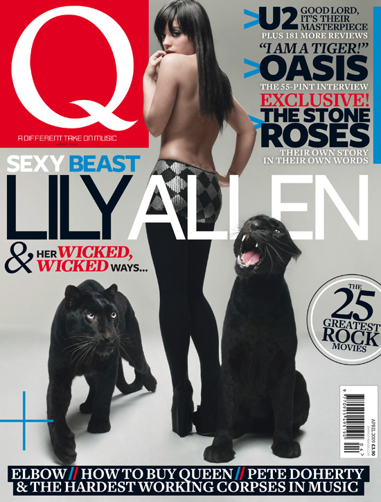
Comparing the front covers of my school magazine and my music magazine, one can see that there is a lot more content included on the music magazine's cover. This is because I learnt that magazines should try to use the space on the cover as effectively as possible, as the things on the cover are what's most likely to attract people to buy the magazine. I decided to see how my music magazine cover would look if it had roughly the same amount of content on it as the school magazine cover. I did this by hiding all additional elements of the cover and cropping it, and the picture left shows the results. As one can see, it really does look quite pathetic and empty. By the way, the half erased button on Kerry's shoulder is what's left when I remove the album cover that was previously obscuring it, and is not meant to be seen as another fault of the cover. 


Another thing I learnt in the progression from my preliminary to my main task was how modes of address differ in different types of magazines. In my school magazine, despite there not being much written content, one can see that there is a rather condescending tone. This is seen by the use of phrases like "cool kids" and "fun" on the contents page. On my music magazine's contents page, however, there is the phrase "bloody amazing". This difference in language is not necessarily just due to the magazines being aimed at different age groups, after all the age group of my target audience starts at 15, rather it is because school magazines are given out for free so there is less need to appeal to the target audience. In music magazines you are trying to entice someone to actually buy your product and so coming across as patronising is not a good idea, as people don't like to be looked down upon and will therefore not buy the magazine. In the image above right I've highlighted some phrasing in the school magazine contents page that could be seen as patronising. I learnt that it would be best not to use anything that may be seen as such anywhere in the music magazine.

A big thing I learnt going from the production of my preliminary to my main task was the importance of audience feedback. This was something I didn't consider much while making my school magazine, as I was not yet used to my classmates and didn't feel comfortable enough to question them about my work. However, in the time that passed I got to know people quite well and realised that some of them fitted perfectly into my target demographic. I asked these people for their opinions on my magazine and it often proved useful in telling me what was good, what needed to be changed and so on. I also showed my work to people outside of school who also could be part of my readership, so that I had a wider range of opinions than just those of my classmates. You can see references I've made to how feedback from others influenced me throughout my blog and also you can see comments that my classmates gave me.


Overall my progression through this project has taught me a lot. I learnt that just having a magazine that looks visually like a real product isn't good enough as there are many other factors (such as those described in this post) to take into account. I am happy with my music magazine and it is far superior when compared to my school magazine. If I were to go back and re-do my preliminary task I am confident that, using what I have since learnt, I would be able to make it to a much higher standard.

Evaluation Question 6

What have you learnt about technologies from the process of constructing this product?

I used a variety of different technologies in the production of my magazine, both in terms of software and hardware. Before I could begin any of the designing stages I had to take photographs, for which I used a digital camera. However, even before I did this I had to research real life music magazines to get an idea about how to pose my models and about what to include in terms of mise-en-scène, and these are things I've described under Main Cover Image on the first evaluation question. Once I'd thought (albeit vaguely) about these things I had to take the actual pictures. I decided to use a digital camera as it allows for easy transfer via SD/xD card to the computer, which was important as all my photo manipulation needed to be done on the computer. For the first photoshoot I used a Kodak EasyShare 9.2 megapixel camera, and took photos on a variety of different settings. This was very easy to use as it was a lightweight digital camera for general use, but I wasn't totally happy with the quality of the shots. That's why for the next two photoshoots I used a Nikon digital camera which I borrowed from one of the girls who I was taking photos of. The camera was much better and more meant for the type of serious photography I wanted to be doing; the only problem was that I was unused to it and found it quite difficult to use. However, I got a lot of practice and feel much more confident now in using such cameras.

The other hardware I used were computers, and there isn't really much to say about them as I used them more for the software which ran on them. The only thing that is worth mentioning is the types of computer I used: at school I used one of the media room's Apple iMac machines while at home I used a Dell XPS computer running Windows Vista. Both machines are quite different from each other and I was originally much more confident in using my own home computer, though after practice I was able to adapt well to the iMac. I still prefer my computer though, as I feel it allows one much more freedom, in terms of running programs, editing files and settings etc. However, these sorts of things weren't too important in the creation of my magazine and the Adobe software (which was important) worked just as well on both machines.


The main way in which I used technologies in the creation of my magazine was through computer programs. This includes more professional software like Adobe Photoshop CS4 and Adobe InDesign CS4, as well as casual things like Grab (on macs) or Print Screen (on Windows), Microsoft Word and Microsoft Excel, Firefox and the websites one can access via it, such as Blogger, Wikipedia, Youtube etc. I used all of these and more at one point or another throughout this project, but all except Photoshop and InDesign I was already adept at using before the media studies course began. As this evaluation question is asking specifically what I have learnt I feel that it would be pointless to waste time talking about things I already knew about. Therefore I shall focus on how I used Photoshop and InDesign to great effect in the creation of the magazine, and also what I've learnt about in each.

I used Adobe Photoshop for all the photo editing and manipulation that I had to do in the creating of my magazine, and it was also the program in which I did all of my contents page and cover (as opposed to the contents page, for which I used Photoshop to do the editing of the included elements but InDesign to compile everything together to manufacture a finished product). This ranged from things as simple (but long-winded) as cutting out the backgrounds from photos to the more complicated, such as applying make-up effects to a person's face and filters. The screen grab above-right demonstrates how I did the finishing touches of cutting Jonny out from the background for use on the second draft of my contents page. This particular stage involved me first using the lasso tool to cut a rough edge which went around Jonny, so that all the far outer bits were excluded. Then I had to go around Jonny's body, erasing every bit of background that still remained around him (this is the process pictured). Finally I used the blur tool on Jonny edges, so that did not look too sharp as this makes it clear that an image has been cut out from its original background. There are easier ways to remove the background from an image, such as using the magnetic lasso or magic wand tool, but these are really only effective when there is an obvious discrepancy between the foreground image and the background, like having the model pose in front of a white screen. The original picture of Jonny had the intricacies of cupboards, bricks and work tools in its background, so it was too complicated for Photoshop to automatically cut out. These were all things that I learnt as I went along through the project, experimenting with different techniques with varying degrees of success (or more often failure).


The screenshot to the left depicts the differences between an original photo and the edited version which I used as the band image on my double page spread. I feel that it looks so much better after having been edited, and will talk through what I did to make it that way. The first thing I did was to pump up the exposure, using the exposure adjustment function on Photoshop. Exposure is defined as being the total amount of light allowed to fall on the photographic medium during the process of taking a photograph, and so increasing it using Photoshop but the whole picture brighter and also made the background plain white. Having a plain white background made it easier for Photoshop to distinguish it from the people in the foreground, and so the next thing I did was use the magic wand tool to cut out the girls so a transparent background was left. The picture above-left shows what the photo looked like when selected by the magic wand tool. The only problem left was that certain parts on the girls were unselected, while some parts of the white background were selected. To solve this I used the quick selection tool, to de/select certain parts of the image more carefully. The final end product can be seen in context on my double page spread. Once again, I learnt this mainly through trial and error, though I also had help from various internet tutorials. 


As I mentioned previously, I found InDesign really quite difficult to get used to after having grown accustomed to Photoshop. However, after a lot of t&t (time and tutorials) I had learnt a lot about it and its usefulness when working with primarily written content. One particular feature that I found useful was the ability to text wrap. This was where you can set a margin around an image and then make the text wrap around it. Having this meant I was able to properly use up all the space around the image without having random masses of white, and as wrapping text around images is also what real music magazines do it helped add to the realism of it.


I learnt a considerable amount about different technologies during the creation of my magazine, especially regarding Photoshop and InDesign. There are other instances where I explain the technology I've used in my step-by-step cover and contents page sections and also elsewhere on the blog.

Evaluation Question 5

How did you attract/address your audience?

I analysed and described my target audience in detail in the last evaluation question and will now look at how my music magazine is able to attract this audience. However, it should be noted that a lot of factors in the magazine I consider to be appealing to all types of people, which is in a way better than just doing things according to my target audience as it means there is still a possibility of people from outside my target audience taking an interested. If I had based the entire magazine solely around what my target audience liked and no one else did then any potential impulse buyers could feel alienated and be put off. To be honest though this would be unlikely to happen, as I am targeting a mass audience which means their likes and dislikes will be considered the norm for society as a whole.

The first thing one notices when looking at my magazine's cover is the large photo of the cover girl, Kerry Anne. It has to be assumed that Kerry Anne is an ex-member of a well-known pop band, and that people are interested in her, as unfortunately my actual pop star friends were unavailable for a photo-shoot at the time I was taking the pictures. With this assumption one can see how giving Kerry such prominence on the cover would be effective in attracting my audience, as they would see on the shelves an image of a famous pop star and take an interest in the content relating to her within the magazine. The pull-quote/lure of "I'm done with the band, it's time to move on" heightens the potential buyer's interest, as the quote is likely to make them think "Wow, I wonder what that's all about" and then purchase the magazine to find out more.

Another thing which is likely to appeal to my target audience is the section of text in the black box at the top of my magazine cover. I've included the image on the left to show how my header fits in with those used by real music magazines; the fact that these are popular things to use obviously show that they are good at attracting the target audience since if they weren't good magazines wouldn't include them. What's more, each of the headers in the picture I took from the front covers of monthly music magazines, and as my magazine is also monthly it shows that I am doing what is particularly liked by the audience of monthly music magazines. The content of the header itself is about three boys who made a youtube video but rose to viral infamy. One should assume that this "Rockability" band's video is on a similar level of fame to Tay Zonday's "Chocolate Rain", and so the hipper internet-savvy people will have heard of it and be interested in learning more.

As was basically the case with the previous two points, the audience is likely to be most interested in content relevant to artists they are particularly fond of. This means that putting the names of popular artists who are written about in the magazine would be a good way of attracting my audience, and so it would make sense to try and fit as many artist names as possible on the cover without becoming over-obtrusive. This I achieved with my plus section, an idea which I took from other popular music magazines (see pictures). People will now have even more reason to buy my magazine, since as well as being interested in the main story they may be interested in one of the bands/singers mentioned in the plus section.

The mode of address is defined as the ways in which relations between addresser and addressee are constructed in a piece of media, which is in this case my magazine. My double page spread article was where I addressed my audience most through text, and the pictured section has things which show how I did this. Firstly one can see that I used colloquialisms, such as "chilly", rather than more rigid sounding terms like "cold" or "low temperature". This is good as my audience are unlikely to be looking for extremely formal passages of text when buying a music magazine, and so the non-formal language will appeal to them and make them feel comfortable. Saying that her flat is in Stevenage is effective at addressing my audience in a friendly tone, as it is giving the contextual information that would be provided were they having a conversation with someone. The talking about of what the interviewer is impressed by adds to this; the reader feels closer to the interviewer and understands his thoughts and feelings. When the interview starts we actually hear Kerry speak directly, and this is appealing to the reader since they almost feel as though they are talking to this amazing pop star directly. I also used square brackets to show the surnames of the other band members, to show how close Kerry was to them that she only refers tot hem by their first names. This adds to the realism of the magazine and again makes it more like actually reading what someone has said.

I did actually find it quite difficult to attract and address my audience directly, and feel that I ended up including things that would just appeal to anyone. This is because I defined my audience as being a mass audience who would be in varied age groups and have varied interests which made it difficult to pick up on particular things they would like. In this regard it may have been easier to make a magazine themed around the rock metal genre of music, as I would have known to use lots of dark colours and jagged fonts.

Evaluation Question 4

Who would be the audience for your media product?

Q magazine describes their readership as being "Open minded experience seekers, the Q audience don’t define themselves by the music they listen to. Music is an important passion, but their love of music will never be to the detriment of their other passions, such as film, sport and comedy." This seems to be showing that Q is aimed towards a mass audience rather than a niche one, as opposed to a magazine like Kerrang! which focuses almost entirely on rock. I have already drawn (in question 2) similarities about which social group my magazine represents and that which Q represents, and the target audience relates heavily to this idea of representation. Therefore my target audience is likely to be similar to that of Q but not exactly the same, as I chose to distribute my magazine with Bauer Media and they would not like it if two of their magazines had the exact same target audience and were competing against one another.
The foremost reason for needing to look at target audience is obvious: so that one can make the magazine's content appealing to them and therefore sell lots of magazines and make lots of money. For example, it would be foolish to do an exclusive interview with Eminem for a hard-core rock and metal music magazine, as metalheads would not be interested in it and would not buy the magazine. Another reason for needing to know one's target audience is for advertising. An extremely high proportion of a music magazine's revenue comes from advertising, and I found from my research that over one fifth of Mojo magazine is made up of adverts, and this was not even including Mojo's adverts for its own concerts and subscription offers etc. To make sure that advertising is effective one must know their target audience so that companies know to put adverts in magazines that have the same target audience as their product. Another example; it would be a waste of time, money and effort to place an advert for the Playboy channels in an issue of Woman's Weekly and the magazine creators probably wouldn't allow it anyway, as it would alienate their audience.
The following is my own audience profile, which will describe the average reader of my magazine in terms of socio-economic groups, personal tastes in media and attitudes. 

Age
Young people (15 to 25) who are interested in more mainstream, casual music acts such as Cheryl Cole, Black Eyed Peas and Green Day are likely to be the main age group to take an interest in my magazine. The accompanying photo shows what this age group within my target audience might look like. However, there is also room for my audience to include slightly older people (30 to 45) who take an interest in the music they hear on the radio or on TV adverts and buy music magazines about them to try and be trendy. I had to keep both age groups in mind during the creation of my music magazine.


Socio-Economic Groups
I conducted some research on socio-economic groups so that I could get a clearer idea of how to categorise my target audience.  I priced my magazine at £4.20 which is quite a high price for music magazines in general though a more average price when one considers the higher prices of monthly magazines. This higher price means that I should be aiming my magazine at the higher socio-economic groups, such as B and C. However, this is actually not very realistic, as there is not necessarily any indication that people in higher socio-economic groups are more likely to buy my magazine. In fact, according to economic theory, poorer people have a higher tendency to spend than richer people, who are more likely to save. This is kind of irrelevant though, as the most important factor for someone deciding whether to buy my magazine is their personal interests, and I believe that all people are equally likely to have an interest in my magazine's content regardless of their occupation. One should also consider that since my target audience's age group starts at 15, it is likely that the younger members of my audience will not have jobs and will therefore technically not fit into any socio-economic groups.


Music Tastes
As already mentioned I consider my target audience to have more broad music tastes as a mass audience, rather than being particularly attached to a single genre as a niche audience. The image to the left shows a selection of albums by artists that I think my target audience would like/be interested in. These artists bear quite little similarity in terms of musical style, but they have the common factor that they are all popular bands/singers commonly heard on the radio and well-known to the general public. My audience are likely to be the kind of people that happily listen to and enjoy the type of music that other people say is good, rather than trying to expand their interests into specific genres and learning about obscure bands. This sounds like I am being critical of my target audience but this is not the case; everyone has their own tastes and just as someone with individual tastes shouldn't be criticised people with totally run-of-the-mill tastes shouldn't be criticised either.


Social Status/Groups
This would usually be considered quite an important segmentation of target audience, though for my magazine I don't feel it is to a great extent. The social groupings of Kerrang!'s audience would include things like grungers, goths and emos while the readership of Mojo would be considered oldies or hippies. I am personally not a big fan of such generalisations, but it is a fact that they are used regularly by advertisers in determining who to aim their product at. However, my dislike for them is not what makes these groupings less relevant to my magazine. The reason is that I am appealing to a mass audience which encompasses lots of different types of people, and so trying to neatly categorise them all would be pointless. If I absolutely had to though, the only thing I would be able to say is that my audience are quite mainstream. This means that they themselves do not dress in a particular way and tend to like whatever things it is normal to like at that moment. The above "tribe map" which I took from uktribes.com, a website which analyses the different social groupings of Britain, depicts what are considered to be the main types of young people. In relation to this, I'd say that the people buying my magazine would fit into a mixture of the Urban, Mainstream and Trendies categories, though still primarily in Mainstream as I said previously. The Alternative grouping would likely be uninterested in my magazine with its more general coverage, since they have their own specific tastes and disapprove of people who like the same things as the majority.

Evaluation Question 3

What kind of media institution might distribute your media product and why?

Throughout this project I have been looking at, for reference, five music magazines: Mojo, Q, Uncut, NME and Kerrang!. After doing this so far I decided to continue to do it when answering this question, and therefore decided to choose as the distributor for my magazine the publisher of one of the five music magazines I have been looking at. This, however, leaves me with a limited choice, as only two companies are responsible for distributing all five of these magazines and many more besides. This is not really surprising, as the entire consumer magazine industry is dominated by only a few companies.  They can be seen in this table which I made for my magazine analysis, and are as follows:

IPC Media summary (from their website)-
IPC Media produces over 85 iconic media brands, with our print brands alone reaching almost two thirds of UK women and 44% of UK men – almost 27 million UK adults – while our online brands collectively reach 20 million users every month.
IPC's diverse print and digital portfolio offers something for everyone, with a focus on three core audiences: men, mass market women and upmarket women.
Our men's portfolio (IPC Inspire) comprises a wealth of leisure brands including Country Life, Horse & Hound, Rugby World and Decanter, as well as lifestyle brands including Nuts, Mousebreaker and NME.

Bauer Media summary (from their website)- 
Bauer Media reaches over nineteen million UK adults across multiple media channels. We have more than eighty influential media brands spanning a wide range of interests, including heat, GRAZIA, Closer, MCN, FHM, Parker's, MATCH, Magic 105.4, Kiss 100, Kerrang!, 4Music and the Big City Network, our group of twenty local radio stations.
Our business is built on millions of personal relationships with engaged readers and listeners. We connect audiences with compelling content, whenever, wherever, and however they want. Our unique insight allows us to work closely with our customers to develop innovative solutions that create a difference to their business.

The magazine which I conducted my in-detail analysis of, Mojo, and the magazine which I decided in Evaluation Question 2 to be closest to my magazine in content and in terms of representing a certain social group, Q, are both published by Bauer Media; this really does give me quite an easy choice. However, there are other factors to consider as well, such as the circulation. If I want my magazine to be successful then I want it to be distributed by a company which has a track-record of having high levels of circulation. Bauer manages to beat IPC in this area as well, since its weekly music magazine's (Kerrang!'s) circulation is 43,253 while IPC's weekly music magazine's (NME's) circulation is 40,948. This is largely irrelevant, since my magazine is going to be a monthly one, but Bauer's monthly music magazines also have a much higher circulation than their IPC counterpart. Both Q and Mojo have a circulation exceeding Uncut's by well over 20,000. 
Another good thing about Bauer Media is that it already publishes two monthly music magazines, and therefore shouldn't be worried about losing sales through competing against itself. IPC Media only publishes one monthly music magazine, and publishing my magazine as well might put the sales of Uncut at risk; it would obviously be stupid of them to distribute my magazine if the majority of money they'd be making was being taken away from their sales of Uncut as people bought Untitled instead. This means that Bauer should theoretically be more willing to distribute my magazine. However, there is also the possibility of this going the other way, and Bauer not wanting to publish a third monthly music magazines as it already publishes two.


In conclusion, I have decided to have Bauer Media distribute my magazine. This is because it already has experience in publishing two very popular monthly music magazines, and should therefore have the expertise to make my magazine a success also. The image to the left shows the covers of different Bauer Media magazines with mine among them, and I think that it looks quite in fitting with the company's image (as varied as it is). All covers feature a single person most prominently on the cover, and while this is not always the case it does seem to be the majority of the time.

Evaluation Question 2

How does your media product represent particular social groups?

I feel that my music magazine represents the more casual music fan, in that it does not focus on any specific genres of music but instead covers a wide variety of things. This is why I have chosen to compare my main cover image to one of Q's main cover images, since they usually have what are considered more casual singers/bands on their cover, such as Cheryl Cole, Madonna (see below), Michael Jackson, Lily Allen, U2 etc. Just to clarify, by casual I mean singers and bands that are well-known to the general public and are not considered to be a part of a specific sub-genre of music; things that your aunt and your little brother could both equally enjoy listening to. For example, those artists that I mentioned had been on Q's cover are casual. In contrast, Slipknot has been on the cover of Kerrang! more than once but are definitely not what I would consider to be a casual band, the same goes for Pink Floyd and their being on Mojo's cover several times (despite being a completely different genre of music to Slipknot). This means that the social group my magazine most represents is that of the general music-liking populace, a much more mass audience rather than niche audience, and this is highly unlikely to include the "music aficionados" of Mojo, the "individually minded" of Kerrang! or the mostly unemployed "entertainment enthusiasts" of NME.
To get a better idea about how the social groups which my magazine and Q represent are different and similar, I shall compare the cover images between the two magazine covers. The first, and probably most obvious, similarity is that both images are of females. What's more, both females are attractive and are staring at the camera in a seductive way, in a medium close-up shot. They are also similar in that they have perfectly clear skin and make-up, in my case this is because of edits in Photoshop and I wonder how much Photoshop is to thank for Madonna's flawless appearance on Q's cover as well. From what I can see their poses aren't too dissimilar either; both have one hand up by the neck, but Madonna's hand is in the foreground turned toward the camera while Kerry's is in the background. I personally like it more in the way Kerry posed, as the hand does not obscure or detract attention away from the face at all. However, creating a sense of obscuration and mystery may be exactly what this cover of Q was trying to do, since Madonna's head and body are covered by a kind of silky curtain. This gives an overall different image to my cover; it seems more sultry and mature than the innocent yet rebellious attitude presented in my image. Another difference which supports this is that Kerry is looking upwards at the camera while Madonna is staring at it directly. This suggests that Madonna is older and more powerful, while Kerry is young and still has to look up to/at others.
Overall my image is still representative of the same social group as the Madonna image, and one can imagine that if Kerry Anne were still popular and attractive when she reached Madonna's age she would be positioned on a music magazine cover in a similar way to her.

Evaluation Question 1

In what ways does your media product use, develop or challenge forms and conventions of real media products? 

There are a wide variety of types of music magazine, and therefore a wide variety of different conventions to which the different magazines abide. Just as newspapers are divided between quality and popular (eg. The Times and The Sun) music magazines seem to be divided between the quality monthly publications and the popular weekly publications. Earlier, in my magazine analysis and masthead analysis, I had a look at the different music magazines and decided that Mojo, Uncut and Q constitute as the quality magazines while NME and Kerrang!. I chose to make my magazine as a quality publication, which is why I shall be referencing more the codes and conventions of magazines like Mojo and Uncut, though I shall still look at NME and Kerrang! to get a better idea of the codes and conventions of music magazines as a whole.
For the most part, I have retained the conventions of real life music magazines rather than trying to challenge them, though there are certain factors which I have developed to try and make my magazine have a degree of originality. For example, most music covers I've seen which feature a female artist show a full body shot (here, here, here and here) but I've chosen to do a medium close-up on a girl's face, the type of which is usually reserved for male musicians (here, here, here, here and here). This may be, from a feminist perspective, due to readers of music magazines being more concerned about women's bodies than their faces, while not caring especially about the bodies of men featured. I have challenged this habit (since it is not really a convention as such) through my having a medium close-up of a female, and this shows that my magazine does not conform to the sexist norm of the music magazine industry.
I am now going to analyse how specific parts of my music magazine relate to their relevant conventions.


Title
Before constructing my list of possible magazine titles I carefully looked at the titles of real music magazines and thought about their connotations. I didn't take them into account too much when constructing my first list of possible titles since at that point I was concerned only with getting as many possibilities written down as possible. I did, however, consider real magazine titles a lot when creating my shortlist of possibilities. I ended up choosing the titles Stereo, Untitled Track (which became Untitled), Restless, Experience and RockIt. All these titles (after accounting for Untitled Track being changed to Untitled) are one-word, though RockIt could be considered a sort of combination of words. The titles of the five main music magazines, with the exception perhaps of NME since it stands for New Musical Express, are all one word, so I used this convention in the selection of my title.
I feel my final chosen title, Untitled, was good and managed to use conventions of real media products and also perhaps develop them slightly. It is a word that can be related to music (on albums there are often untitled tracks, which is why I originally came up with the title Untitled Track) but can also have other meanings. In this way it is similar to Mojo and Q; mojo is a term used colloquially to describe coolness and charm and this links to the coolness of music, Q's title was originally taken from "cue", as in the sense of cueing a record, ready to play. It also fits in with the conventions of what I said earlier to be the quality music magazines, in that the title sounds calm, casual and mature, rather than the excitable impression one gets from the title Kerrang!.

Title Font and Style
I feel that the font and style of my title seem to fit in quite well with the conventions of real music magazine mastheads. Quite a while ago I did an analysis of each magazine masthead so that when I designed my own masthead I had a better idea of what sort of style to go for and what sort of impression I wanted to give off. When I look at the design of my magazine title compared to real music magazine titles I feel that it fits in quite well. I used the font Oceania, as it is a simplistic sans-serif font that looks quite calm and dignified though not overly pretentious. In this way it is similar to the basic font used for Mojo, NME, Kerrang! and Q, but not Uncut since it is serif. Uncut's title, however, manages to overcome the possibility of appearing overly formal with its serif font by having a 3-dimensional effect applied to it. I liked this to an extent, and so applied a metallic effect to my masthead to give it a more 3-dimensional appearance, complete with a drop shadow like that of Mojo and Q (though quite a bit harder than Q's).
The metallic effect I used on the title could be seen as challenging conventions of real life music magazines, though I see it more as developing them. The was a danger of the masthead becoming overly complicated with all the multitudes of effects I applied to it to achieve the desired look but fortunately I, and the other people whose opinions I asked, found this not to be the case. In fact I believe that when viewed in its place on the cover of the magazine, the masthead fits the subdued black and whites in the colour scheme well. It is similar to how the title complements the image and background on this magazine cover (see right):


Written Content
It was essential for the written content of the magazine to be in fitting with the conventions of music magazines, as they are known for their use of colloquial language and conversational tone. It is important to note that the language used in music magazines does differ greatly depending upon whether it is in a popular publication or a quality publication. For example, Kerrang! and NME don't hesitate to use swear words whenever they want to, be it in headlines or reviews. Mojo and Uncut, however, only really use swear words when quoting song or album names or in direct interviews when it is the interviewee who is swearing. The comparison on the left between a Mojo double page spread (top) and a Kerrang! double page spread (bottom) supports this; Mojo's standfirst talks about "beer-drinking" while Kerrang!'s talks about "pissing about". Since as I said before I wanted to create a magazine that leaned more toward the side of the quality publication rather than the popular, I decided to not casually use swear words or childish puns.
The place in my magazine where there is the most written content is the double page spread, and I chose to make it in a interview format as this is the type of writing commonly associated with music magazines. I used the conventions of music magazines in that I had a standfirst, an interviewer and photographer name, an introductory paragraph (these are usually used in articles to provide information in prose prior to the actual interview) and the actual question and answer section. I made the questions have a bold effect, so that they were easily distinguishable from the answers; this is a technique used in the majority of music magazines (see the interview comparison). 
Another section of written content which relates to the conventions of music magazines is on the front cover. It is the pictured section which has a lure; a pull-quote from an article within which encourages the reader to buy the magazine so they can find out the whole story. This technique is used very often on music magazines, as it is an effective way to grab the attention of people who may not be regular readers and get them to take an interest in your magazine (see the picture of lures taken from various music magazines).


Main Cover Image
My main cover image uses a lot from the conventions of real music magazines, though it does challenge them slightly in the way I mentioned earlier in this post. Looking at the mise-en-scène of the image will be a good way to see how it compares to real examples. First is the background, I removed it completely from the original photo (see here) and added a white one which I used the gradient tool to add a sort of black frame to. The vast majority of music magazines either cut out the background or take their photos with a blank background to begin with, which gives the same effect. Then, rather than just keeping the background as a single colour, they add a gradient effect to give the image more depth (see the Lily Allen Q cover). 
The next aspect of mise-en-scène is Kerry herself, the girl in the photo. It is fair to say that, with some exceptions, the women presented on the covers of music magazines always look beautiful and sexy (see again the Q cover of Lily Allen and also the Madonna one). I feel that Kerry is indeed a very attractive young lady, and is therefore fitting to be on the cover of my music magazine. She is also doing quite an alluring pose, with her hand by her neck, her head turned looking up over her shoulder and her eyes gazing provocatively, yet still somehow innocently, into the camera. The lipstick effect I added also helps to make her look good, and real magazines also put lots make-up on their cover girls (or add it on afterwards using Photoshop as I did).
The lighting of the image is something else that I changed to try and make the image look more in fitting with real music magazine covers. I applied a spotlight effect over Kerry's left eye, and this makes her expression more vivid and also makes the photo look like it was taken in a professional photographer's studio. The light effect is complemented by the gradient effect in the background, as they look like realistic shadows in relation to the shining light.


Contents Page Sections
I divided my contents page into three different sections, Features, Reviews and Regulars. I had decided to this quite early on in the planning stages after having looked at how real music magazines separated the content on their contents pages. The main contents page I looked at was Mojo's (see right) and it separated its contents into the sections Features, Regulars, What Goes On! and The Mojo Filter (the features section of the contents is on a page by itself). The only thing under What Goes On! was news, so I instead chose to put my news sub-section into my regulars section and retitled it "Hugh's News", to give it that individualistic touch. Most of the things under The Mojo Filter section were related to reviews, so I simplified that in my contents by just having a Reviews section. 
Another thing I noticed in a lot of music magazines was that the most prominent feature on a magazine's cover (the one that the main image and headline relates to) was titled "Cover Story" in the contents and set away from the rest of the features. I used this convention and did my own take on this by having a sort of "Cover Story" logo, which one can imagine being put next to the main story in the contents page of every issue.

Essential Music Magazine Elements

I struggled to come up with a suitable name for this section, but it is basically things that have to be included on music magazines. Such things are the barcode, date and price; all things which have to be included on music magazines and which therefore add greatly to the realism of my magazine when placed on it. If you were to look at any music magazine cover you would see these elements included, so this is yet another convention I am effectively using.

Monday 15 March 2010

Main Task - Music Magazine Double Page Spread Second Draft

I made relatively few changes for this draft, but I feel that they definitely improve the quality of the double page spread and were worth doing.
The first change was the re-positioning of the pull-quote so that it was directly within a single column rather than bridging across two. I did this because I thought that in its previous position, although more interesting, the text box mucked up the alignment of the text so that it looked perfectly square on the right hand side but jagged on the left hand side. Moving it solved this, and it also meant that all the text in the columns was moved down slightly, therefore achieving my other objective of making the text closer to Kerry's head. I did in fact add more text as well to make the text get even closer to her, but it ended up detracting from the photo of her face and also was difficult to read as there was only one word a line.
The next thing I changed was the cutting out and text wrapping of Kerry Anne's main photo. It was fairly unnoticeable, hence why I didn't mention it in the post itself, but some of Kerry's arm and front had been made completely white instead of their actual colour when I used the clipping path tool to too great an extent. I rectified that issue in this draft by using different clipping tool settings (previously I used detect edges, this time I used Alpha Channel) and making sure carefully that I had only cut out what needed to be cut out. Also doing this meant that the outer edges of Kerry's body and hair were cut out more smoothly, since it is more difficult in inDesign to manually cut and smooth things than it is in Photoshop.
Other than some very minor text editing, the final change I made was to change the font used in the standfirst and contextual paragraph from Georgia to Book Antiqua. I did this because I wanted to retain the formal impression that Georgia gave off but wanted something a bit less obtrusive and bulky. When one compares them side-by-side the difference can easily be seen, or at least I can easily see it.
Hopefully this is of a high enough standard to be my final draft, but I will need to get opinions from my teacher and classmates before I can decide whether this really is the case.

Friday 12 March 2010

Main Task - Music Magazine Double Page Spread First Draft

Well, here it is. My double page spread.
It seems my worries about having to possibly cut out some of my text were unfounded, as it in fact turned out that I needed to add more text to try and fill up the space! In an ideal world I still would have liked to have written a bit more, so that the text reached the top of Kerry's head on the right-hand page and there would have been less white space. However, I can try and do this in a later draft.
I used the software Adobe InDesign CS4 to create my double page spread. I used this rather than Photoshop (which I used for the cover and contents) because Photoshop is primarily a photo manipulation program, as I learnt the hard way when manoeuvring the different pieces of text one by one on my contents page. InDesign is different in that, as the name suggests, it is a program for designing things, such as posters, flyers, brochures, magazines and books. I found using InDesign quite challenging though, since it functions almost completely differently to Photoshop and therefore took a lot of time to adapt to. Once I got the hang of it though I found it to be extremely useful, so I am glad I persevered with it.
I still used Photoshop in the creation of the DPS, insofar as I still had to use it to edit my photos. On both the pictures I pumped up the exposure and cropped them, and the band picture on the left I also placed into a polaroid-camera type frame. The right-hand picture took an amazingly long time to crop as I had to go through the usual process of lassoing and then erasing stuff a bit at a time, and then perfecting it all with the blur tool. That probably doesn't sound too strenuous but it really was, since I had to be careful to cut away only the background and not accidentally cut off any of Kerry herself, and the picture was of a really large size which didn't help. I think that some parts of her still look slightly as if they were cut out, but overall I feel I did a pretty good job.
I found it quite difficult to arrange the text in a way which I deemed to be interesting, and it was mostly a process of trial and error in which I tried many different layouts and combinations (some of which I'll post later in a step-by-step DPS section). After the headline of the article I had what I considered to be the "background information" paragraph (though its official name is a standfirst): a section of text which gives the reader a brief overview of who the article/interview is about/with and why this person is interesting. Underneath this I had the names of the interviewer and photographer (both fictional of course, as putting "Chris Coales" for everything would be boring). I placed the names here as I noticed from my research on music magazines that this is the usual place for putting them; in fact there are very few instances indeed on double page spreads where this isn't the case.
After this I began arranging the text in columns, with the first section of text in the columns being an introductory paragraph: a section written in prose which sets the scene and possibly describes the interviewer meeting the interviewee. I used this section to provide more contextual information on Kerry Anne and briefly describe the surroundings. I typed this section in the font Georgia, the same font I used for the "background information" paragraph, because I wanted to use a different font from the one I was to use for the actual interview so as to distinguish between them. I think I achieved this quite well, and I don't think that the fonts clash too badly at all.
The next, and longest, section of text was the interview itself. I used the font Calibri as it is sans-serif which distinguishes it from Georgia which is serif. I also feel personally that Calibri has a comfortable simplicity, the kind that can be put to good use in magazines where there is a lot of small text to read. I put the questions in bold to show when the interviewer was speaking, and separated each set of question and answer by a single line for uncluttered readability. I also copied a quote from the text out and enlarged it and coloured it red, as this technique of taking an especially interesting quote from an article and drawing attention to it is used regularly in music magazines.
I wrote more than I originally meant to here, and there are less stages involved in making something in InDesign than in Photoshop, so I will not need to do a post this time showing step-by-step information of how I made my double page spread. As always, comments are welcomed.

Thursday 11 March 2010

Main Task - Music Magazine Cover Third Draft

I changed very little from my second draft to my third draft, which should hopefully be an indicator that I have reached my final draft. The first thing I changed was that I shifted the alignment of the "Plus" section of the text to the right, as this is what the covers of music magazines tend to do.
The other thing I did was try to cover up the gold button on Kerry's shoulder, as I was told that it was distracting since it looked rather prominent on the cover. I covered it up by nudging the Leanne Bell album cover upwards, which covered up half of the button. I then used a combination of the patch tool, clone stamp tool and blur tool to remove the rest of the button on Photoshop, and eventually did so to a standard I considered adequate. I also swapped around the positioning of the "The Accelerators" story with the "Leanne Bell" story, so that the album cover would be next to the relevant piece of text.
This is likely to be the final draft of my cover, so long as no one else is able to give me any ideas as to what I can change.