
In what ways does your media product use, develop or challenge forms and conventions of real media products?
There are a wide variety of types of music magazine, and therefore a wide variety of different conventions to which the different magazines abide. Just as newspapers are divided between quality and popular (eg. The Times and The Sun) music magazines seem to be divided between the quality monthly publications and the popular weekly publications. Earlier, in my magazine analysis and masthead analysis, I had a look at the different music magazines and decided that Mojo, Uncut and Q constitute as the quality magazines while NME and Kerrang!. I chose to make my magazine as a quality publication, which is why I shall be referencing more the codes and conventions of magazines like Mojo and Uncut, though I shall still look at NME and Kerrang! to get a better idea of the codes and conventions of music magazines as a whole.
For the most part, I have retained the conventions of real life music magazines rather than trying to challenge them, though there are certain factors which I have developed to try and make my magazine have a degree of originality. For example, most music covers I've seen which feature a female artist show a full body shot (here, here, here and here) but I've chosen to do a medium close-up on a girl's face, the type of which is usually reserved for male musicians (here, here, here, here and here). This may be, from a feminist perspective, due to readers of music magazines being more concerned about women's bodies than their faces, while not caring especially about the bodies of men featured. I have challenged this habit (since it is not really a convention as such) through my having a medium close-up of a female, and this shows that my magazine does not conform to the sexist norm of the music magazine industry.
I am now going to analyse how specific parts of my music magazine relate to their relevant conventions.
Title
 Before constructing my list of possible magazine titles I carefully looked at the titles of real music magazines and thought about their connotations. I didn't take them into account too much when constructing my first list of possible titles since at that point I was concerned only with getting as many possibilities written down as possible. I did, however, consider real magazine titles a lot when creating my shortlist of possibilities. I ended up choosing the titles Stereo, Untitled Track (which became Untitled), Restless, Experience and RockIt. All these titles (after accounting for Untitled Track being changed to Untitled) are one-word, though RockIt could be considered a sort of combination of words. The titles of the five main music magazines, with the exception perhaps of NME since it stands for New Musical Express, are all one word, so I used this convention in the selection of my title.
I am now going to analyse how specific parts of my music magazine relate to their relevant conventions.
Title

I feel my final chosen title, Untitled, was good and managed to use conventions of real media products and also perhaps develop them slightly. It is a word that can be related to music (on albums there are often untitled tracks, which is why I originally came up with the title Untitled Track) but can also have other meanings. In this way it is similar to Mojo and Q; mojo is a term used colloquially to describe coolness and charm and this links to the coolness of music, Q's title was originally taken from "cue", as in the sense of cueing a record, ready to play. It also fits in with the conventions of what I said earlier to be the quality music magazines, in that the title sounds calm, casual and mature, rather than the excitable impression one gets from the title Kerrang!.
Title Font and Style
 I feel that the font and style of my title seem to fit in quite well with the conventions of real music magazine mastheads. Quite a while ago I did an analysis of each magazine masthead so that when I designed my own masthead I had a better idea of what sort of style to go for and what sort of impression I wanted to give off. When I look at the design of my magazine title compared to real music magazine titles I feel that it fits in quite well. I used the font Oceania, as it is a simplistic sans-serif font that looks quite calm and dignified though not overly pretentious. In this way it is similar to the basic font used for Mojo, NME, Kerrang! and Q, but not Uncut since it is serif. Uncut's title, however, manages to overcome the possibility of appearing overly formal with its serif font by having a 3-dimensional effect applied to it. I liked this to an extent, and so applied a metallic effect to my masthead to give it a more 3-dimensional appearance, complete with a drop shadow like that of Mojo and Q (though quite a bit harder than Q's).
 The metallic effect I used on the title could be seen as challenging conventions of real life music magazines, though I see it more as developing them. The was a danger of the masthead becoming overly complicated with all the multitudes of effects I applied to it to achieve the desired look but fortunately I, and the other people whose opinions I asked, found this not to be the case. In fact I believe that when viewed in its place on the cover of the magazine, the masthead fits the subdued black and whites in the colour scheme well. It is similar to how the title complements the image and background on this magazine cover (see right):
Written Content
 It was essential for the written content of the magazine to be in fitting with the conventions of music magazines, as they are known for their use of colloquial language and conversational tone. It is important to note that the language used in music magazines does differ greatly depending upon whether it is in a popular publication or a quality publication. For example, Kerrang! and NME don't hesitate to use swear words whenever they want to, be it in headlines or reviews. Mojo and Uncut, however, only really use swear words when quoting song or album names or in direct interviews when it is the interviewee who is swearing. The comparison on the left between a Mojo double page spread (top) and a Kerrang! double page spread (bottom) supports this; Mojo's standfirst talks about "beer-drinking" while Kerrang!'s talks about "pissing about". Since as I said before I wanted to create a magazine that leaned more toward the side of the quality publication rather than the popular, I decided to not casually use swear words or childish puns.
 The place in my magazine where there is the most written content is the double page spread, and I chose to make it in a interview format as this is the type of writing commonly associated with music magazines. I used the conventions of music magazines in that I had a standfirst, an interviewer and photographer name, an introductory paragraph (these are usually used in articles to provide information in prose prior to the actual interview) and the actual question and answer section. I made the questions have a bold effect, so that they were easily distinguishable from the answers; this is a technique used in the majority of music magazines (see the interview comparison).

 Another section of written content which relates to the conventions of music magazines is on the front cover. It is the pictured section which has a lure; a pull-quote from an article within which encourages the reader to buy the magazine so they can find out the whole story. This technique is used very often on music magazines, as it is an effective way to grab the attention of people who may not be regular readers and get them to take an interest in your magazine (see the picture of lures taken from various music magazines).
Main Cover Image

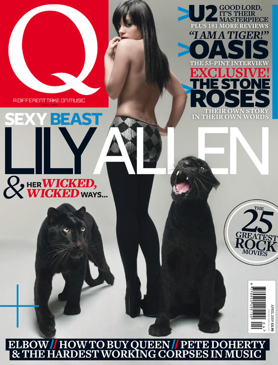
 My main cover image uses a lot from the conventions of real music magazines, though it does challenge them slightly in the way I mentioned earlier in this post. Looking at the mise-en-scène of the image will be a good way to see how it compares to real examples. First is the background, I removed it completely from the original photo (see here) and added a white one which I used the gradient tool to add a sort of black frame to. The vast majority of music magazines either cut out the background or take their photos with a blank background to begin with, which gives the same effect. Then, rather than just keeping the background as a single colour, they add a gradient effect to give the image more depth (see the Lily Allen Q cover).
 The next aspect of mise-en-scène is Kerry herself, the girl in the photo. It is fair to say that, with some exceptions, the women presented on the covers of music magazines always look beautiful and sexy (see again the Q cover of Lily Allen and also the Madonna one). I feel that Kerry is indeed a very attractive young lady, and is therefore fitting to be on the cover of my music magazine. She is also doing quite an alluring pose, with her hand by her neck, her head turned looking up over her shoulder and her eyes gazing provocatively, yet still somehow innocently, into the camera. The lipstick effect I added also helps to make her look good, and real magazines also put lots make-up on their cover girls (or add it on afterwards using Photoshop as I did).
The lighting of the image is something else that I changed to try and make the image look more in fitting with real music magazine covers. I applied a spotlight effect over Kerry's left eye, and this makes her expression more vivid and also makes the photo look like it was taken in a professional photographer's studio. The light effect is complemented by the gradient effect in the background, as they look like realistic shadows in relation to the shining light.
Contents Page Sections

 I divided my contents page into three different sections, Features, Reviews and Regulars. I had decided to this quite early on in the planning stages after having looked at how real music magazines separated the content on their contents pages. The main contents page I looked at was Mojo's (see right) and it separated its contents into the sections Features, Regulars, What Goes On! and The Mojo Filter (the features section of the contents is on a page by itself). The only thing under What Goes On! was news, so I instead chose to put my news sub-section into my regulars section and retitled it "Hugh's News", to give it that individualistic touch. Most of the things under The Mojo Filter section were related to reviews, so I simplified that in my contents by just having a Reviews section.
Another thing I noticed in a lot of music magazines was that the most prominent feature on a magazine's cover (the one that the main image and headline relates to) was titled "Cover Story" in the contents and set away from the rest of the features. I used this convention and did my own take on this by having a sort of "Cover Story" logo, which one can imagine being put next to the main story in the contents page of every issue.
Essential Music Magazine Elements


I struggled to come up with a suitable name for this section, but it is basically things that have to be included on music magazines. Such things are the barcode, date and price; all things which have to be included on music magazines and which therefore add greatly to the realism of my magazine when placed on it. If you were to look at any music magazine cover you would see these elements included, so this is yet another convention I am effectively using.


Written Content


 Another section of written content which relates to the conventions of music magazines is on the front cover. It is the pictured section which has a lure; a pull-quote from an article within which encourages the reader to buy the magazine so they can find out the whole story. This technique is used very often on music magazines, as it is an effective way to grab the attention of people who may not be regular readers and get them to take an interest in your magazine (see the picture of lures taken from various music magazines).
Main Cover Image

 My main cover image uses a lot from the conventions of real music magazines, though it does challenge them slightly in the way I mentioned earlier in this post. Looking at the mise-en-scène of the image will be a good way to see how it compares to real examples. First is the background, I removed it completely from the original photo (see here) and added a white one which I used the gradient tool to add a sort of black frame to. The vast majority of music magazines either cut out the background or take their photos with a blank background to begin with, which gives the same effect. Then, rather than just keeping the background as a single colour, they add a gradient effect to give the image more depth (see the Lily Allen Q cover).
  The next aspect of mise-en-scène is Kerry herself, the girl in the photo. It is fair to say that, with some exceptions, the women presented on the covers of music magazines always look beautiful and sexy (see again the Q cover of Lily Allen and also the Madonna one). I feel that Kerry is indeed a very attractive young lady, and is therefore fitting to be on the cover of my music magazine. She is also doing quite an alluring pose, with her hand by her neck, her head turned looking up over her shoulder and her eyes gazing provocatively, yet still somehow innocently, into the camera. The lipstick effect I added also helps to make her look good, and real magazines also put lots make-up on their cover girls (or add it on afterwards using Photoshop as I did).
The lighting of the image is something else that I changed to try and make the image look more in fitting with real music magazine covers. I applied a spotlight effect over Kerry's left eye, and this makes her expression more vivid and also makes the photo look like it was taken in a professional photographer's studio. The light effect is complemented by the gradient effect in the background, as they look like realistic shadows in relation to the shining light.
Contents Page Sections

 I divided my contents page into three different sections, Features, Reviews and Regulars. I had decided to this quite early on in the planning stages after having looked at how real music magazines separated the content on their contents pages. The main contents page I looked at was Mojo's (see right) and it separated its contents into the sections Features, Regulars, What Goes On! and The Mojo Filter (the features section of the contents is on a page by itself). The only thing under What Goes On! was news, so I instead chose to put my news sub-section into my regulars section and retitled it "Hugh's News", to give it that individualistic touch. Most of the things under The Mojo Filter section were related to reviews, so I simplified that in my contents by just having a Reviews section.
 Another thing I noticed in a lot of music magazines was that the most prominent feature on a magazine's cover (the one that the main image and headline relates to) was titled "Cover Story" in the contents and set away from the rest of the features. I used this convention and did my own take on this by having a sort of "Cover Story" logo, which one can imagine being put next to the main story in the contents page of every issue.
Essential Music Magazine Elements


I struggled to come up with a suitable name for this section, but it is basically things that have to be included on music magazines. Such things are the barcode, date and price; all things which have to be included on music magazines and which therefore add greatly to the realism of my magazine when placed on it. If you were to look at any music magazine cover you would see these elements included, so this is yet another convention I am effectively using.


No comments:
Post a Comment